Get Expert IT Solutions For Your Business – Natural Group

-91 9090909090

support@nscspl.in

bootstrap-logo-rounded-free-png-removebg-preview

Empowering progress through intelligent technology

Bootstrap: Responsive Front-End Framework for Modern Web Interfaces

BootStrap is a powerful front-end framework used for developing responsive and mobile-first web applications. Built on HTML, CSS, and JavaScript, Bootstrap provides a comprehensive collection of pre-designed components, utilities, and grid systems that enable developers to create visually appealing and consistent user interfaces efficiently. In this project, Bootstrap was utilized to design and enhance the user interface of the Tender Module, ensuring a responsive layout and seamless accessibility across various devices and screen sizes.

Bootstrap’s extensive library of reusable UI components—such as modals, forms, buttons, and navigation bars—significantly reduced development time and effort while maintaining design consistency throughout the application. The framework’s responsive grid system ensured adaptability, providing users with an optimal viewing experience across desktops, tablets, and smartphones.

The project leveraged Bootstrap 5, the latest major version of the framework, which eliminates dependency on jQuery and embraces modern web standards through vanilla JavaScript and enhanced customization options via CSS variables and SASS support. This version also introduced improved utilities, a redesigned grid system, and better support for accessibility, enabling a cleaner and more efficient front-end development process.

Understanding Bootstrap:

Bootstrap is an open-source front-end framework that helps developers create responsive, mobile-first websites quickly. It includes prebuilt HTML, CSS, and JavaScript components, eliminating the need for complex styling. With its grid system, customizable themes, and cross-browser compatibility, Bootstrap simplifies modern web design and enhances development efficiency.

💡What is Bootstrap?
Bootstrap is a free and open-source front-end framework used to design modern, responsive, and mobile-first websites quickly and efficiently.
🚀 Why Use Bootstrap?
  • Responsive Design – Automatically adjusts to all screen sizes.
  • Prebuilt Components – Use ready-made UI elements instantly.
  • Customizable – Modify colors, layout, and theme easily.
  • Cross-browser Compatibility – Works seamlessly on all major browsers.
  • Community Support – Backed by a massive developer community.

Our Expertise in Bootstrap Development:

At Natural, we leverage Bootstrap, the world’s most popular front-end framework, to design and develop responsive, mobile-first, and visually engaging websites. Our team uses Bootstrap’s robust grid system, reusable components, and customization options to deliver sleek, consistent, and high-performance web experiences.

  • 🧩 Custom Framework Integration: We go beyond default Bootstrap styling by seamlessly integrating and customizing its components to align with your unique brand identity, design language, and business objectives. From typography and color schemes to responsive layouts and interactive elements, we ensure every detail reflects your organization’s visual personality while maintaining a clean, scalable, and high-performance framework.
  • 📱 Responsive Design Approach: We craft websites with a mobile-first mindset, ensuring every layout, image, and component automatically adjusts to different screen sizes and devices. Whether viewed on a smartphone, tablet, laptop, or large desktop display, your website will deliver a seamless and visually consistent experience. Our approach enhances usability, accessibility, and performance—so your users stay engaged no matter where they are.

  • Faster Development: Leveraging Bootstrap’s extensive library of prebuilt utilities and components, our developers accelerate the entire development process without compromising on quality or precision. This streamlined approach allows us to build robust, scalable, and visually consistent interfaces in less time—ensuring faster delivery, reduced costs, and a smoother path from concept to launch.

  • 🚀 Seamless Integration: Our framework effortlessly integrates with other Spring projects and third-party libraries, creating a unified and cohesive development environment. Whether connecting with Spring Security, Data JPA, or external APIs, this flexibility ensures smooth communication between modules, reduces compatibility issues, and accelerates overall project delivery—all while maintaining stability and scalability across your entire application stack.

  • 🌐 Cross-Browser Consistency: We rigorously test and optimize every element of your website to ensure it looks, feels, and performs flawlessly across all major browsers. Whether your users prefer Chrome, Safari, Firefox, Edge, or Opera, they’ll experience the same smooth interactions, pixel-perfect layouts, and reliable functionality. Our meticulous attention to compatibility guarantees a unified user experience—no matter where your audience visits from.

Integration of Bootstrap in Our Products

At Natural , we have seamlessly integrated Bootstrap into our accounting platform to enhance usability, responsiveness, and visual consistency across all modules. Using Bootstrap’s powerful grid system and prebuilt components, our team designed an intuitive user interface that simplifies navigation, improves data visibility, and ensures a smooth user experience on any device. From dynamic dashboards to responsive reports and interactive forms, Bootstrap enables us to maintain a clean and efficient layout that adapts perfectly to desktops, tablets, and mobile screens. By customizing Bootstrap’s core styles and utilities, we’ve aligned the interface with our brand identity while ensuring scalability for future enhancements.


Conclusion

By integrating Bootstrap into our accounting website, we’ve achieved a balance of functionality, performance, and modern design. Its responsive framework allows us to deliver a seamless experience across all devices, while its flexibility supports continuous improvement. With Bootstrap, we ensure our platform remains fast, user-friendly, and visually consistent — empowering users to manage finances effortlessly.

WHO WE ARE

Built Relationships with Government Clients

We have a proven track record of delivering secure, high-quality projects for public sector organizations.

10+ Years of Public Sector Experience
Strict Regulatory Compliance
ISO 27001 Information Security
Full Project Transparency
Regular Audits & Reporting
Unwavering Reliability
Client Meeting
Project Team
Office Building
Collaboration

OUR REACH

Trusted by Leading Indian Clients

We are proud partners to numerous businesses across India, delivering innovative and tailored solutions.

Strong Local Presence
Diverse Industry Portfolio
Cost-Effective Solutions
Deep Regional Market Expertise
Dedicated Local Support
Long-Term Partnership Focus
Executive Partners
Market Strategy
Development Center
Launch & Scale

FAQS

We’re here to answer all your Bootstrap questions.

What is Bootstrap?

Bootstrap is a popular open-source front-end framework used for designing responsive and mobile-first websites. It provides prebuilt CSS and JavaScript components, such as navigation bars, buttons, modals, and forms, that help developers create consistent and modern web interfaces efficiently.

Why should I use Bootstrap for my project?

Bootstrap saves development time with ready-to-use UI components and a powerful grid system. It ensures design consistency, supports responsive layouts by default, and integrates easily with existing frameworks. Developers can also customize Bootstrap to match their brand’s style using Sass variables.

What are the key features of Bootstrap?

Bootstrap’s key features include a responsive grid system, pre-styled UI components, extensive documentation, browser compatibility, and powerful JavaScript plugins. It also supports custom themes and can be easily integrated with frameworks like React, Angular, and Vue.
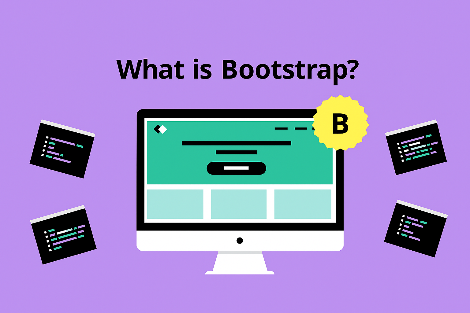
How does Bootstrap help in responsive design?

Bootstrap’s 12-column grid system allows developers to create layouts that automatically adjust based on the screen size. It uses media queries and flexible containers to make websites look great on all devices — from desktops to tablets and mobile phones — without writing complex CSS.

Call Now Button